Choosing a typography is an art in itself. With the range of elements, a minimalist site has to do away with; words are imperative for a website to express the website’s emotion.
One of the crucial elements, text, requires special attention when it needs to sit on a beautiful site. Therefore, weaving a stunning, sharp and even custom typography is the ideal approach you can adopt while designing a minimalistic website.
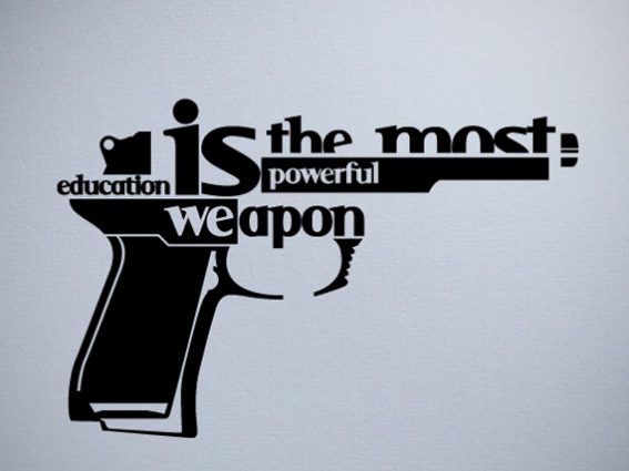
Typography attracts eyeballs on the words and matters within the site that accompanies the creative visuals. Impressive typography often incorporates a striking style that is dominated by thick strokes. It also marks a perfect blend of dominant typeface and neutral typeface depending on the design needs.
Recommended:
Art of use Typography In Logo Design : 50 Stunning Examples
30 Fresh And Imaginative Typography Design
The typography decision can appear small and insignificant but bettering the same can yield a vast improvement in the website.
Let me tell you a story about Steve Jobs and how he revolutionized the perspective towards typography in the first Mac itself. He came up with ten font design to choose from. It may not impress you now, but back in those days, it was a big deal in design.
The impact of such a decision was so significant that instantly he was being referred to as the Granddaddy of Typography.
Because, before that, such was a way of the computer to interact with human beings.
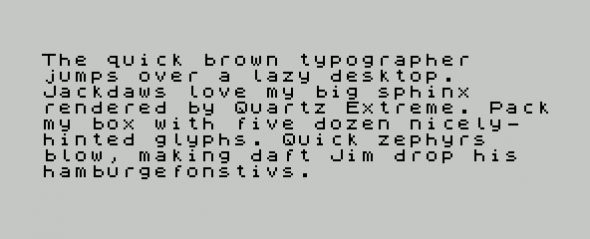
Therefore, it is best to weave the typefaces aesthetically in the website to lure readers in navigating more. Remember;
- Each typography possesses a distinctive style of communicating a message – This is one of the ways to integrate brand image with the choice of typography. It possible to convey the tone of a message with a mere selection of typography. Some fonts can convey trust, stability, strength, elegance, sophistication, creativity, etc. as font psychology works differently for each typeface. For example, accounting or legal business will have a distinctive approach to choosing the typography than with the case of building a website for wedding photography business.
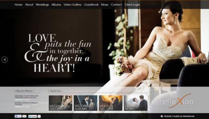
And therefore, the sort of typography style you pick up for the website reflects a lot about your business, and what your site is all about. When you are in the process of making a minimalist website, then you must also make sure that website design too remains in sync with the font face you select.
- Make sure that the typography is sparse enough not to jumble up the message you want to communicate with the website. The beauty of minimalistic website lies in scattered texts and well-spaced-out typography. It is called typography scaling. The typography scaling is important as it establishes a font face hierarchy that improves the readability by creating cohesiveness in a flatly designed website.
- Dramatic use of typography becomes a golden rule while incorporating texts in the minimalist website. It is because of the site leaving a lot of negative space by using fewer elements. Here is the chance where the choice of typography can play a significant role in creating the desired effect out of a website design and its content.
- Typography in the minimalist web design should be oriented towards communicating the message in with the least possible words, and in a best possible way. The beauty lies in concentrating on the ease of readability of site’s content than making it a painful exercise otherwise.
- Make sure that the typography has a depth and rich More than anything else it is imperative for the designer to choose the typography based on aesthetics of the website to harmonize the entire navigation experience for the users. Utmost attention should be given to the tone and readability. It is the weight of typography, hidden in its thickness, edges, and size that defines the tone of the message.
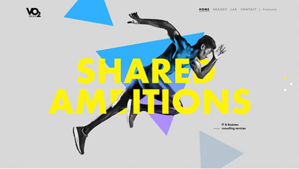
A minimalist website is highly dependent on the content that complements its design. Therefore, choosing a typography is a skillful task that defines the impressiveness of a minimalist site.
There are plenty of other tricks that web designers uses such as the big typography in place of graphics for creating an impact. For enhancing the visual depth of the content in the minimalistic website, the selected typography is played around with different styles, sizes, and weights for the headings, body, and content navigation. It adds layers of visual emphasis in a minimalist website.
Author Bio: Shahid Abbasi is a big time tech geek working with the best mobile app development company, Peerbits. He has a proven efficiency over designing mobile apps for the enhanced UI/UX for websites and mobile apps.

Great overview of simple ideas to make an effective, eye-catching site. Thanks for the food for thought. I may or may not have highly overused Comic Sans as a teacher!