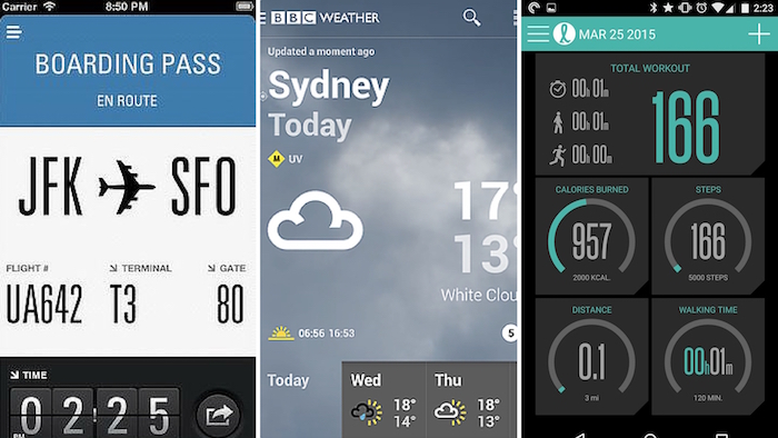
App Typography came to the fore when Apple revamped the system fonts used by it in iOS 7. This was in 2013 and since then typography has been a crucial element of app designing. In the Android L too, Google worked on their existing fonts and polished them. Even after typography was made an important part of the overall OS design, the apps have not been able to be in sync with it. It is still the most ignored aspect of app designing and the apps often suffer due to its negligence.
A great design and app typography are two wheels of the same design vehicle. They must go hand in hand or there is a chance of the entire design going haywire. When users browse through an app, they read the content so if we discuss the portrayal of the communication between the app and the users, it is about the typography that influences the user experience and not just about the typefaces used in the text.
Also read:
30 Fresh And Imaginative Typography Design
Best Engravers Fonts, Engraved Fonts For Inspiration, Projects
Different mobile operating systems are now making changes in the typography and it cannot be without reasons. The typography is now driven by the UI/UX and all app developers and designers must be aware of how the typography helps augment the UI/UX of an app. Read on to explore.

- The overall App design is complemented by Typography
Text being a major part of the app, the typography directly impacts the overall appearance of an app. Before the app design process is started to, there must be a thorough research on the typography that will suit the app and will engage the audience. If necessary, a new typography can also be created to achieve a high degree of uniqueness and meet the requirements precisely. You can also integrate different font styles and use them to render exclusivity to the app. It will elevate the value of the app and will engage the users on a better level. Ignoring the importance of typography will lead to an app that might end up looking mediocre. Such apps will never be accepted by the users even if they are coded well.
- It makes your apps expressive
The app must have all the ingredients to engage the audience and typography has a major role to play in it. It makes your app connect with the users as the apps are able to influence the psyche of the users through the fonts. In this capacity, the typography is not just a graphic element but a way to the users’ sensibility. The app should not just convey the information to the users but virtually talk to them. An engaging app has to arouse the positive emotions of the users and typography has the potential to do that, hence making you app an engaging one. The loyalty of the users towards the app is inflated and they become responsive when the apps are so expressive with their content.
- Visual hierarchy can be established with Typography
With clearly planned out Typography, you can establish a visual hierarchy of the content. This helps you capture the attention of the users for a longer period. This is because if you use the typography, the flow of information through the website becomes symmetrical. The users are able to sense the visual arrangement of the content on the basis of font style, font face, alignment, and size. Typography helps the users perceive such information and connect to the app in a more responsive manner.
- Facilitates clear communication of messages
A good typography makes the content readable and the users are able to comprehend it in a better manner as they find it quite engaging. The app becomes more trustworthy for the users when they find the app conveying the information in an articulate manner with proper visual hierarchy as discussed in the previous point. When you have to drive the users’ action using words, you better use a good typography so that they feel attached to the app and spend more time on it. To make the typography more effective, you must try to harmonize the app design to it to communicate the message to the users in a more appealing manner.
- Poor Choice of Typography can wreak havoc
When you do not perform enough research before choosing the typography for your app, your app looks mediocre and just another entrant to the app landscape which is not mature enough for it. Even if your app is backed by a great idea with brilliant execution, it will not be able to establish a relationship with the users unless the app’s design and topography gel well together. Although an app is a blend of many factors, typography holds all of these together and gives the app a unique look and feel.
Final Thoughts
Typographic has the potential to impact the app users as it is something perceived by the eyes and invokes a sense of comfort or displeasure. If the typography is well thought-of, it facilitates the users’ interaction with the app and builds their loyalty. It is safe to conclude that it is a major stakeholder in the success or the failure of your app irrespective of the operating system the app is meant for. Therefore, the app designers must understand the importance of typography and give it as much importance as other design elements.
Author’s Bio
Ashni Sharma is a prolific writer apart from being an application developer working with AppsChopper, a well-known app development firm based out of Noida. When she is not developing some pathbreaking mobile apps, she is busy writing blogs on a range of topics related to innovations in mobile technology. You can follow: LinkedIn, Twitter
