The first impression consumers have of your brand often comes from your landing page. This page should have a goal — and you don’t want elements that might distract from the primary purpose.
Top landing pages come in at a 24.7% conversion rate but drop into the single digits for some industries. Know the averages for your field and then strive to beat those. By doing so, you’ll come out in the top percentage of sites known for turning visitors into buyers.
Your first step to upping your conversion rate is knowing what goes into a genuinely great landing page. Here are eight essential components you need:
-
1. Unique Selling Proposition (USP)
Your entire page focuses on the premise of what makes your product or service special. How are you different than your competitors? What is your unique value no one else offers? Start by figuring out your USP, and the rest of the page falls into place.
You may need to study your competition and figure out their USP. Analyzing other brands like yours ensures you come up with something different so customers can tell you apart. However, your USP should also tie into your business philosophy and the reason why you started your site in the first place.
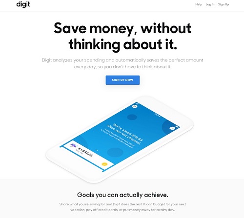
Digit offers the ability to save money on autopilot. They state this upfront on their landing page, pointing out how easy it is to save money with their app. Other companies offer this type of service, but Digit points out how they let you set goals and then forget about them by automating your savings.
-
2. Great UX
The user experience (UX) is everything when it comes to your landing page. From the second someone lands on your page, you want them engaged. The aesthetics make the first impression, but a high-functioning, user-centered design keeps them there. Go through your page and consider how different features work for your target audience. Are all directions clear and concise? Does the page load quickly? Do all the buttons work?
-
3. Segmented Audience
If you’re like a lot of business owners, you may have more than one type of buyer. Segmenting your audience into two or more groups allows for a more personalized experience. It’s likely that more than one type of consumer will land on each of your pages. Directing them to the right location is the best way to guide them through your sales funnel and to the correct information.
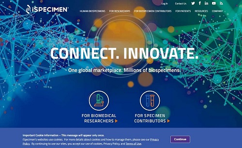
iSpecimen does an excellent job of creating a central landing page and then funneling visitors to one of two areas. One is for Biomedical researchers and the other for specimen contributors. By dividing the audience into two segments, iSpecimen can make their site’s information very specific to each group.
-
4. Customer Reviews
People are much more likely to believe what others say about your brand than what you state about yourself. Including reviews or testimonials on a landing page adds a level of confidence and shows you stand behind your product or service. If you plan to open up your review system to anyone, then you may experience negative comments occasionally. Create a plan to protect your reputation while satisfying the needs of any unhappy customers.
-
5. Attention-Grabbing Headline
Your headline is the first thing people see when they land on your website. They may even notice it in an ad or within their search engine results page (SERP). Your headline does double duty to grab interest and show what the landing page is about. The best headlines describe the page’s goal without getting too wordy. Keep cutting words and look for the most descriptive terms possible.

Grand Canyon University uses the headline, “Pursue your goals with a degree from a Christian University.” Anyone who lands on the page knows what type of school GCU is before they move forward and gather additional information. If someone is searching for a Christian post-secondary school, seeing that headline in search engine results would likely result in a click. By being very detailed in their philosophy, this school attracts highly qualified traffic.
-
6. Limited Links
Stay away from adding too many external links to your landing page. There are two schools of thought on whether you should include navigation. Some feel it detracts from the landing page, while others believe it’s important to have a navbar so users can acclimate themselves to the site’s structure. Whatever you decide, dedicate a purpose for every link on your landing page and make tough decisions about whether they’re needed.
-
7. Active CTA
Your calls to action lead to higher or lower conversion rates. You’ve likely heard all the advice about using action words, sticking with first- or second-person phrasing, choosing a specific color or placing the button in a defined location above or below the fold. Make sure the wording is active, so the button makes it clear what happens when the user clicks on it.
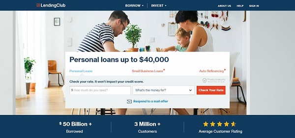
Lending Club has a strong CTA above the fold on their landing page. They offer you the chance to check current rates with a bright orange-red button that reads, “Check Your Rate.” The CTA presents an attractive offer to the target audience, giving them something of value for free.
-
8. Key Benefits
Your landing page needs to outline the advantages of buying your product or signing up for your list. If you don’t convince the user you can help them or improve their life, they aren’t likely to convert into a customer.
Think about the reasons people come to your site in the first place. What is the pain point, or problem, that drives a person to your business? Show them how you solve that issue. Be succinct. Share the information in bullet points or with video testimonials.
-
Test Your Pages
These eight essential elements of an excellent landing page are a great place to start. Once you have the features in place, make sure you conduct some split testing to see how different areas perform. Refine as necessary, try new techniques and keep adjusting your page until your conversion rate reaches the desired level.

Lexie is a digital nomad and graphic designer. She enjoys hiking with her goldendoodle and creating new cookie recipes. Check out her design blog, Design Roast, and connect with her on Twitter @lexieludesigner.
