Web Design Trends change every year and that’s why at BFWR, we are presenting the Web Design Trends that are going to rock in 2016.
Web is ubiquitous and every year the trends change much faster than we expect them to.
Designing is one aspect which changes every year and it evolves more and more when new companies tend to invest their time in the online design. Without good design, any website will fail to gain traction in the online world.
The good thing about the web is that more and more businessmen and entrepreneurs understands design and their impact on user-experience.
Let’s list some of the Web Design Trends of 2016.
14 Web Design Trends in 2016
1. Material Design
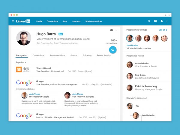
Few days back, we came up with 15 best Material Designs on the web and discussed some of the backgrounds of material design and their importance in current industry.
Material Design is all about minimalism and elegance. With Google going ahead and releasing it on Android Device via Lollipop, there are chances that Material Design will rule the web in the coming year.
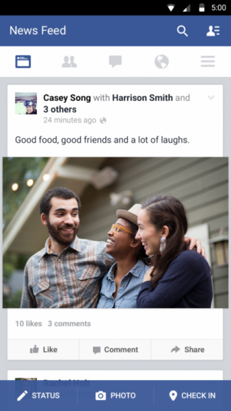
Recent News of Facebook testing their Android App with material design brings more confidence that the new year will be a good year for material design and its lovers.
2. Card Based Design
The true essence of web lies in card based design and I might be going too far away with the prediction, but there are tons of example that tends to fit the idea.
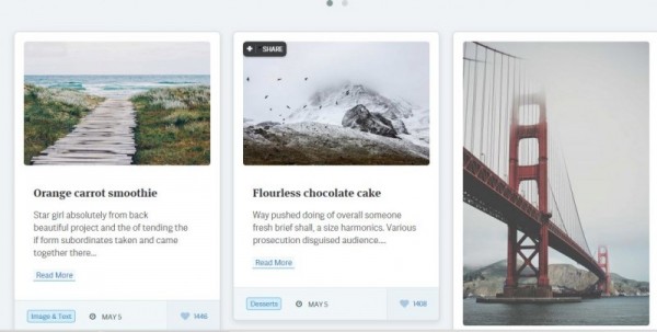
A WordPress Pluto theme is currently trending in ThemeForest, speaks volume about how entrepreneurs or webmasters are getting closer and close to the demand of Card Based Design.
The web just got real with the card based design and many websites are adopted the card based design. Moreover, the design is perfect for responsive web design as cards are the best element that can fit into any screen size.
3. Story Telling and Interaction
The web is revolving around the idea of interacting with the users. And, it’s easy to argue to the fact that the web should always stand to interact with the web. Last year, with the release of all the HTML5 API and now HTML6 is right on the door.
Forbes have an interesting article on how Story Telling can impact the future of web. Read it here.
EverylastDrop is all about storytelling in an impressive way and also making the audience aware to the saving water and how we waste precious water on earth. Another great example is thesearethings.
Why move to story based telling? Because it brings the users more towards the idea of searching the philosophy about the website. The story telling websites with interaction can create more loyal fan following than any other kind of websites.
Interaction websites will also gain traction in the upcoming year. Site like MathiassTerner provides a good example for interactive websites. Interactive websites with storytelling can leap forward on how we see and feel the connection with websites.
4. More Emphasis on Responsive Design
Responsive design is here to stay and in 2016, more and more websites will turn their tables and move towards responsive design.
With sear amount of innovation taking place in the different sector of web and technology, no one truly understands how and when new screen size devices will rule the world. This clearly gives insight on how important the responsive design is.
Another staggering fact that now more than 60% of traffic comes from mobile devices and this clearly points out the importance of Responsive Design in the web.
5. More Scrolling Than Before
Web is evolving and so is the behavior of the users on digital products. A study conducted by HugeInc, proves that users on the web loves scrolling.
The trend is already been evident and can also be seen on BFWR, as we also make our readers scroll deep down into the beauty of the web.
6. Loading Speed
Loading Speeds are important design aspect. Without creating codes that take the intricacies of loading resources fast with less trip journey from the server and the client, is what a designer should look for.
Coding an impressive looking website is an amazing feat, but also making it load faster so that it is optimized for both the users and the search engine is completely different story.
Faster websites have more chances of retaining a reader, whereas a slower site increases the chance of higher bounce rates. That’s why the designer of 2016 should create sites that load faster and smoothly.
The wrong conception of faster internet helping the slow sites is a wrong one. The transfer of files from the server to the client’s machine depends on several factors that are only understood by designers, developers and website speed optimizer professionals.
7. Large Fonts/ Big Fonts
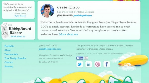
The trend of making everything clear will see its transition from 2014 to 2016, and more and more sites will change their typography to Big Fonts.
The reason, why many of the websites have bigger fonts is to send a clear message to the readers about the credibility of the information in an indirect manner.
Getting tons of fonts that look great in big are not hard now-a-days. Google Fonts is one of the prime example, where you can easily find great looking font for your website. You might look at the trending fonts and that’s where you will understand the importance of big fonts over all other fonts available via Google fonts service.
The big, the better. Some of the examples of Big Font websites are as follows:
8. Simplicity will rule Again.
‘Simplicity is the ultimate sophistication’, a popular quote from Leonardo da Vinci, fits perfectly for the web designing trends of 2016.
Designers know the importance of simplicity and is removing the non-essential design elements from the web. The web is ruled by simple design where both esthetics and loading speed are maintained to the highest level. The level of detail that comes in front of the eyes is too great to ignore.
Currently, there are tons of websites online that conquer to the idea of minimalistic design. Examples include sites such as ChrisWhilHiteDesign, TheGoldOfTheAndies and more.
Design is a complex term and when novice designers come to the design arena, they unnecessarily make design complex without any sense of esthetic and usefulness.
The simple design has a positive impact on the visitors as it soothes the senses and hover their attention to the most important thing that the site is trying to convey with the design. The year of 2016 will see a change in all aspects including simple design reigning over the web world.
9. The Best Big BackGround
Big Backgrounds are nothing new; they have existed on the landscapes of the web world for the past two-year and this year they might still make a major impact on the web designs.
BigBackgrounds offers a great impression on the site philosophy and adds great value to the aesthetics of the website. There are also tons of web site adhere to it, even I took the design aspect of the Big Backgrounds into some of my personal projects.
But, I do conquer that Big Backgrounds are not for every website and should be choose carefully by the designer. Agencies, Organizations, Companies can benefit more from the big background design. Personal websites can also make use of the design with great clarity and detail.
A great example of using big backgrounds is Quartz India, where each post is coupled with a large image that sends tons of signals on how the article will frame out. A great use of big backgrounds by Quartz India.
10. Ghost Buttons
BigBackgrounds are best suited to go with GhostButtons. GhostButtons are powerful minimalistic buttons with sleek edges and sans-serif typography. The GhostButtons offers great attention to the readers in a subtle way with high focus on readability.
These buttons have great transparency and might not qualify as a call for a button, but a great tool for designers to utilize in the current world of high-quality websites.
A great article from SitePoint discusses the rise of Ghost Buttons in an amazing contrast and detail, explaining the origin, positives and negatives of using Ghost Buttons. HireMyFriend is a great example of using GhostButtons to the advantage.
11. Hidden Menus
A clear design can only be achieved when there is less cluttered space and that can only be achieved by the hiding menus, until the user does not look to navigate to other sectionsof the website.
Hidden Menus are common on the mobile devices, but not so common on the desktop websites. The Quartz Site conquer to the hidden menus philosphy and provides a great sense of clarity and minimalistic design.
12. Mobile First Navigation
Considering the path we are moving forward, mobile will sooner or later supress desktop screens. People are on the move and design should always be mobile first. Advanced web designing frameworks such as BootStrap, Foundation and others adhere to the philosophy of mobile first.
This way the website are always ready to be rendered for portable devices and not the other way around. The future of the web surely depends on mobile devices.
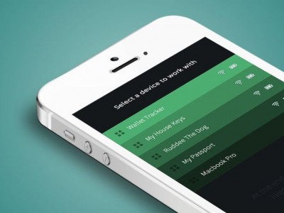
13. Shades of Color
Shades of color do happen to feel attractive from both the user and design prospects. The shades offer a progressive feel for the website and create a cool looking website in no time.
14. The Flow of Data
Privacy is an important aspect for the current web users. The impact of leaving the digital footprints are tremendous and can create an environment where most of the people have no idea what they are leaving behind online.
To keep the ecosystem safe and secure, Designers have to start creating designs that hint users on their privacy settings and bring the most out of the design aspects. Functionality will surely become one of the important part of the design philosophy.
Clear information coupled a great design with make its impact on the web design trends of 2016.
Conclusion
Web Design Trends gives us an idea of what to see in 2016. The implosion of big images/big fonts and responsive design are to watch. Other trends such as privacy, shades of color and simplicity will make the web more beautiful and aesthetically pleasing.
Do you think anything else will make it to the web design trends in 2016? Share it with the BFWR community by commenting below! We will love to hear from the designing god that resides under you! Keep the comments flowing.
Long Scrolling sites are in fact one of the most innovative and useful design trends which is here to stay this year.
Thanks for stopping by, Jaintechnosoft. Scrolling is indeed very useful. Users tend to spend more time on the website, which in turn improves the visibility of the website.
A good metaphor would be Facebook, where users scroll endlessly.